Apple’s miss, blurry creativity, Figma file org, value of tokens
Weekly curated resources for designers — thinkers and makers.
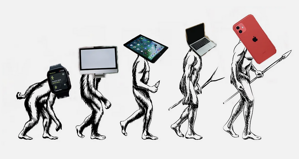
“Last week, at Apple’s annual launch event, we were treated to what is now a common sight: an array of dazzling, shiny new pieces of hardware. The new iPhone Pro treats us to the slickest-looking shell to ever wrap a smartphone. The Apple Watch looks better than ever with new (definitely-not-leather™) bands. More exciting for us software developers were the interfaces we saw introduced, ones not even mentioned at WWDC. For the iPhone, it was the new action button. For the Apple Watch, it was the new Double Tap, something that allows one to trigger any arbitrary action with a flick of the wrist.
It looks shiny.
It looks fun.
It all looks so nice…
…but it’s also useless.”
The missing link in Apple’s event →By Philip Grabenhorst
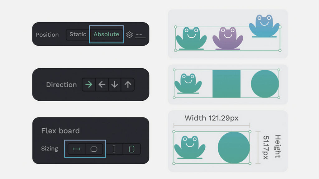
Flex Layout: the design-code game changer →[Sponsored] Flex layout is a new mind-blowing feature by Penpot. Based on CSS, Flex Layout helps designers and developers seamlessly create faster responsive design layouts. Developers can have ready-to-use code and designers gain more control over their layouts. Try it for free.
Editor picks
- Why is creativity so blurry? →
And am I creative?
By Maggie Jandova - The health app paradox →
Can it be solved with emotional AI?
By Maria Kovalevich - Prompt engineers, unemployed →
Why a picture is worth a thousand words.
By Onur Yuce Gun, PhD
The UX Collective is an independent design publication that elevates unheard design voices and illuminates the path to design mastery and critical thinking. Here’s how we’re boosting stories through our partnership with Medium.
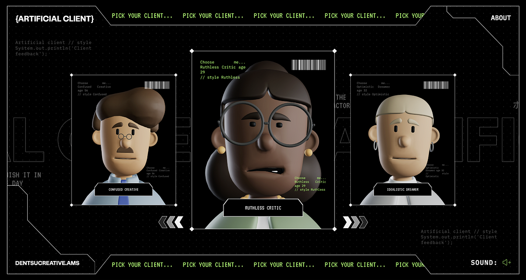
Receive endless feedback on your work with the Artificial Client →
Make me think
- Ableist interactions →
“This week, a product launched and claimed to generate ‘production ready’ code. But it also generates code with accessibility problems, which contradicts ‘production ready’. When someone called this out publicly, a community showed itself from its worst side. What can we learn?” - We are not supposed to live like this →
“We can see it in the deterioration of mental and physical health of people in so called ‘wealthy’ nations, in the exploitation of people in the Global South, and we can see it in the planetary-wide ecological crisis we face. What if, in trying to heal ourselves, we also begin to heal the planet?” - We’re still not innovating with AI-generated UI →
“Not everyone is claiming that their AI tool is particularly innovative. But like most things involving AI right now, we are seeing some pretty wild claims. And we’ve been here before.”
Little gems this week

Why are CNN, FOX, and US websites visually so aggressive? →By Bas Wallet
The real value of tokens →By Erez Reznikov
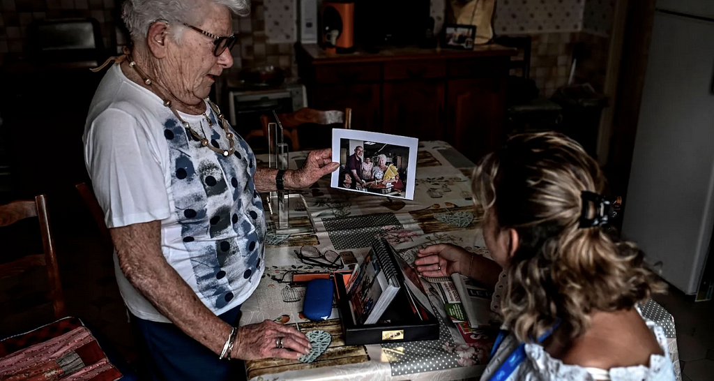
How service design can support people adapt to the climate crisis →
By Sidney Debaque
Tools and resources
- Figma file org →
How to build trust with others by organizing your files.
By Raquel Piqueras - Color for brand designers →
Why your brand colors aren’t working in digital spaces.
By Katie Cooper - No such thing as a “desktop screen” →
Taking responsiveness to the next level.
By Hajime Yamasaki Vukelic
Support the newsletter
If you find our content helpful, here’s how you can support it:
- Forward it to a friend and recommend that they subscribe
- Share open positions on our job board
- Sponsor an edition

Apple’s miss, blurry creativity, Figma file org, value of tokens was originally published in UX Collective on Medium, where people are continuing the conversation by highlighting and responding to this story.